Harness Your Fitbit Data
data-science sports-and-health project Introduction
I am certain that ownership of a Fitbit is highly correlated to obsessive compulsive behavior and a love of data, but I only have this Sedaris essay to corroborate that. When I got my Fitbit Blaze, I thought the pedometer/heart rate monitor/tracker would be an excellent way to generate personal biodata for me to analyze. I was disappointed by the limited dashboard views they offer. Although Fitbit claims that “Your data belongs to you…”, you only get a very small view, as pointed out here. Letting their user base geek out and obsess over their data isn’t high up on their priority list. To this end, I am sharing an approach to dissecting your outdoor runs.
Data from outdoor runs
In an exceptional case, Fitbit let’s the user access the results from a run in an XML file (*.tcx). During my training for the 2016 Hartford marathon, I wanted a way to view my runs to track progress. In addition, the data might offer some way to improve. For example, beginner runners manage pace poorly, either running too fast in the beginning and draining the tank or being too conservative and holding back too much (me). The tcx file offered two response variables of interest: pace (eg miles per minute) and heart rate (beats per minute). A short Python script converts the XML file into a dataframe, which allows a couple of interesting views.
Central Park Training Run
For people who run the same route, a map view can give insight on where particular spots are pain points. For many years, I ran the same loop in Central Park (6.1 miles). Figure 1 shows how my heart rate and pace as a function of location in the park. There’s an additional bit of info that can be layered on, like change in altitude, which might help explain the slow downs and increase heart rate ( the dark red in the upper right corner is a very steep hill in Central Park). Also, the graph shows that I am clearly starting too slow!
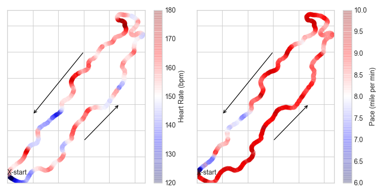
Figure 1: Heart rate (left) and pace (right) as a function of location in Central Park. An “X” marks the starting point of the run and the arrows give the direction of the run. This graph can be layered on top of a satellite using the Python basemap package, but at the time of writing, my interpreter chose not to cooperate.
In case you are less interested in the geographical view, a simple plot of heart rate and pace versus time and distance can be informative, as in Figure 2.
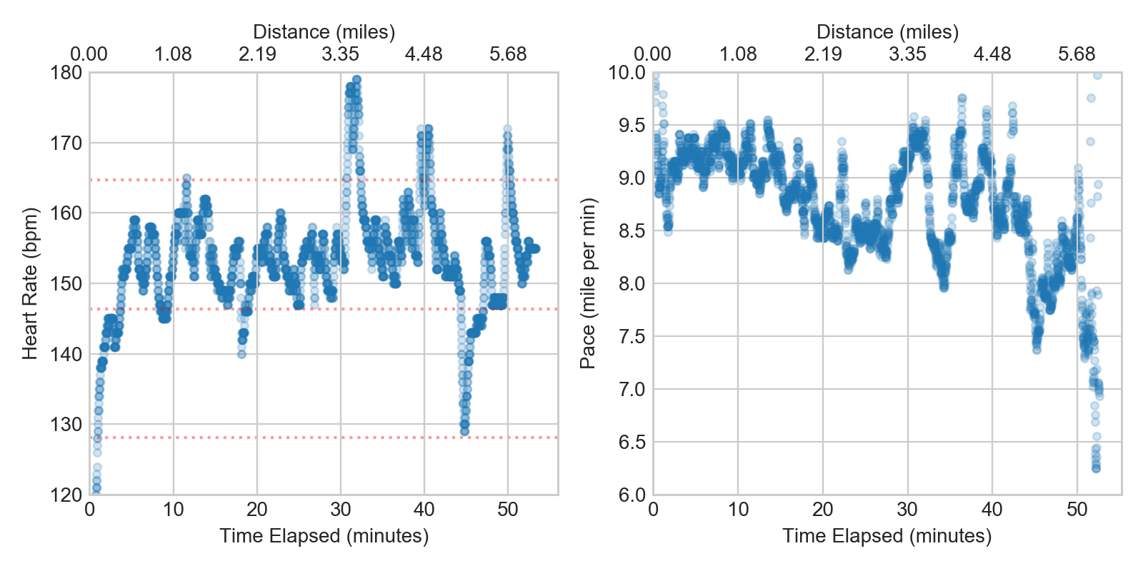
Figure 2: Heart rate (left) and pace (right) as a function of time and distance. The red dashed lines show 70%, 80% and 90% of max heart rate (measured as 220-age).