Child Care Business in NJ
data-science project Continuing my exploration of graphing and maps, I went to NJ.gov to find publicly available data to play with. The first dataset I cam across was on Licensed Child Care Centers, which fortunately for society, is a public safety mechanism that creates requirements for all child care centers and requires their premise to get inspection certificates, which are available online. In addition, there are statistics on each center’s location, capacity, and min/max age. This lead me to wonder: if I were to open a business, I’d prefer to choose a place that is underserved (ignoring Hotelling's law, I am not an economics major, but maybe this business domain is an exception to the law).
The US Census Bureau has 2017 estimates for each county’s population for children under 5. I calculated two metrics for each county:
- Addressable Market: using this term very informally, I defined it as the number of children under 5 in the county minus the county’s capacity to cater to under 5.
- Ratio of children under 5 to child center capacity.
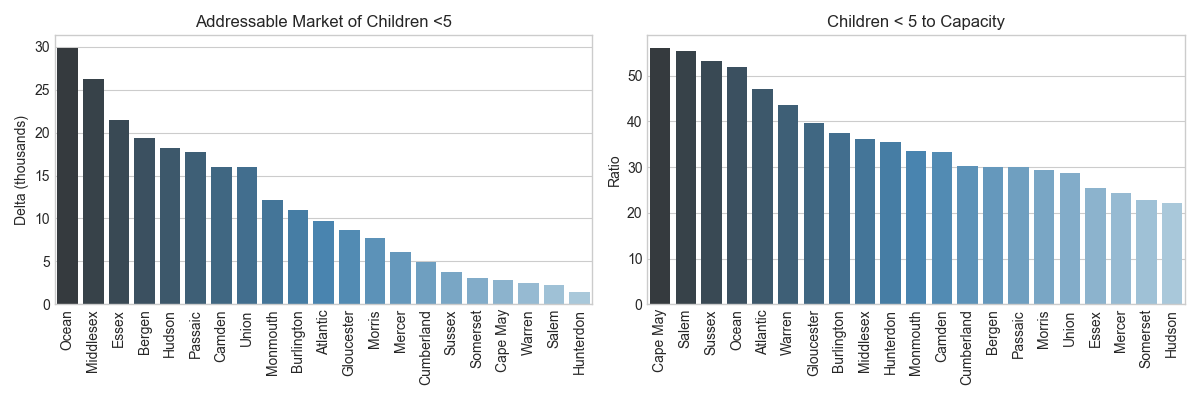
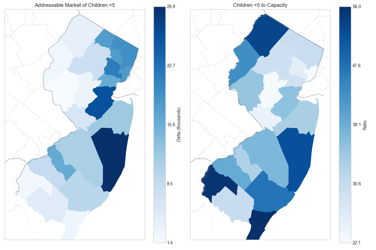
Figure 1 and 2 show the same data, but in different formats. The latter is simply a map; there isn’t additional information, but I thought it was a cool way to show data.
The left side of Figure 1 shows that Ocean, Middlesex, and Essex have 20-30k children that wouldn’t have a care center spot in their county if each operated at capacity (and they were looking of course). Warren, Salem, and Hunterdon have a smaller issue by population size. While this metric provides an idea of how many children cannot be served, it doesn’t give any insight on opportunity because the counties on the left side are ordered roughly in proportion to their population.
The ratio of children under 5 to capacity gives a normalized view. On average, counties have a ratio of 35 children to 1 child care center spot. In other words, 3% of children under 5 use child care centers. The right hand side of Figure 1 shows 6 counties with a ratio of 40:1. These include: Cape May, Salem, Sussex, Ocean, Atlantic, and Warren.
One note on Figure 2: the first metric (left side) shows the darker regions along the coast, which reflects the point above that this metric is proportional to population density (which is higher near the coast). Using the normalized metric, the colors become a little more random (right side). The area close to NYC shows lower ratios, perhaps driven by higher demand for child care services by people that commute to NYC.
There are several factors that determine child care center businesses. If I were really going to look into business opportunities, I would want to cut the data with socio-economic attributes.
Reference
- List of licensed child care centers: https://data.nj.gov/Public-Safety/Licensed-Child-Care-Centers/cru5-4rmm
- NJ counties and there longitude & latitude: http://us.earthdatabank.com/en-US/nj/new-jersey-maps.aspx
- Population estimates: https://www.census.gov/quickfacts/NJ